FM Power
Energy Drink · Packaging & Brand Asset Design
- FM Power (powered by Trokadero)
- Beverage · Energy
- 2022
- [ROLE]
- Can artwork, brand mark, two design routes
The brief
A 250ml energy drink, taurine and caffeine, produced under the Trokadero licence for the Iraqi market. The brief was a single deliverable: can artwork. No existing brand system, no guidelines, no audience definition beyond 'young.' Four routes were requested. Three were worth presenting. One of them stopped being a can design.
The challenge
Energy is the loudest shelf in FMCG. Every competitor is already shouting, so volume alone is not a strategy. It is the entry fee. The real constraint sat underneath that one: FM Power had to read as an energy drink within two seconds and still not look borrowed from the category leader. Those two demands pull in opposite directions, and how far apart you hold them is the entire design decision.
Belong to the category. Borrow nothing from it.
Legible at two metres
Every element on the can was judged at the distance a chiller door is opened. If it does not hold there, it does not make it onto the design.
One ownable element
Colour, gradient and angle are shared property across the entire energy category. The only thing a new brand can truly own is a mark, so the entire design was built around one.
Built to leave the can
Every route was tested off-pack before it was judged on-pack. If an asset only works as a render on a cylinder, it is not a brand asset. It is decoration.
The mark, first.
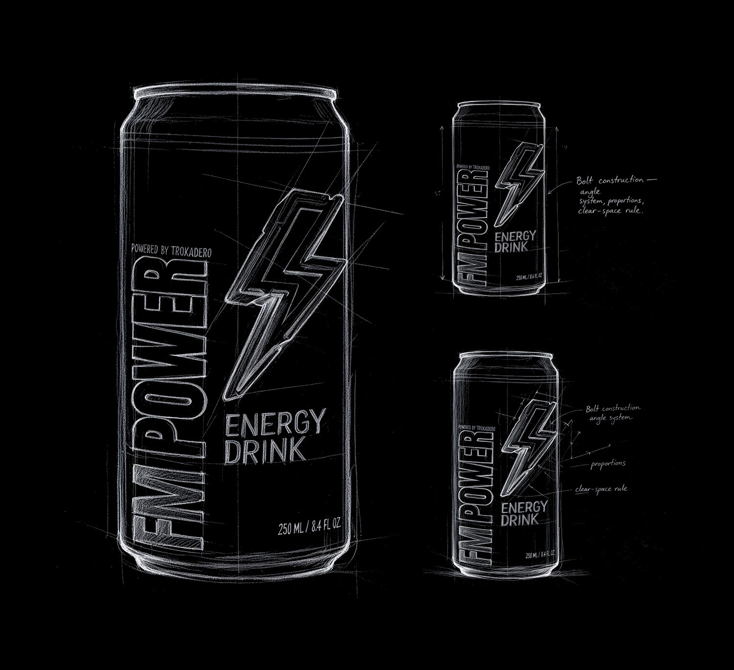
The bolt was drawn before any can artwork existed. The angle system, proportional relationships and clear-space rules were all locked at the outset, so every route that followed inherited the same object rather than redrawing it.
The Bolt
One element, built to be owned.
Flat solid ground · one dimensional element · nothing else rendered
Every other element on an energy can is rented. Gradients, diagonals, chrome, halftone fields. The category shares all of it, and a design assembled from shared parts can be reproduced by the next brand within a season.
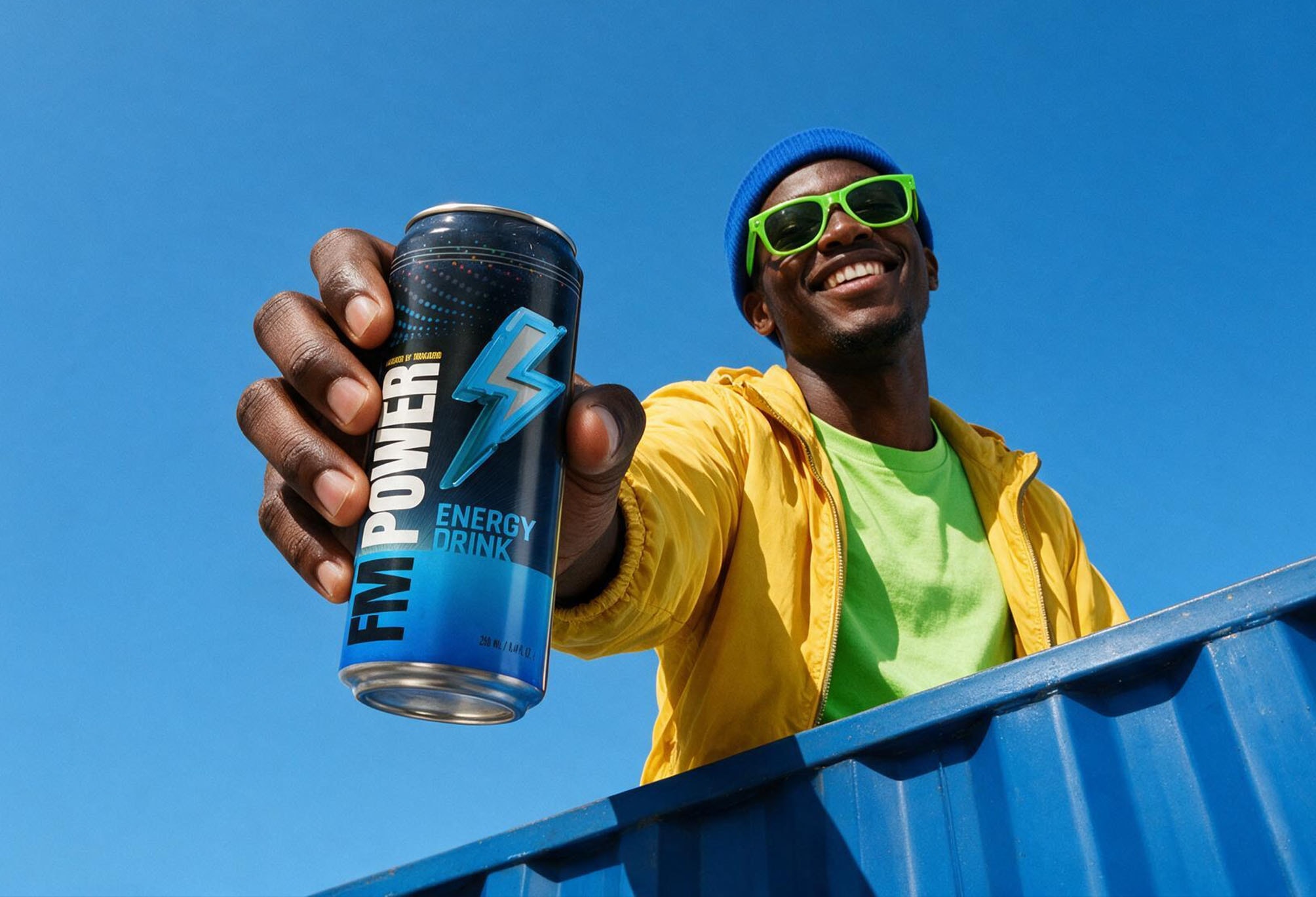
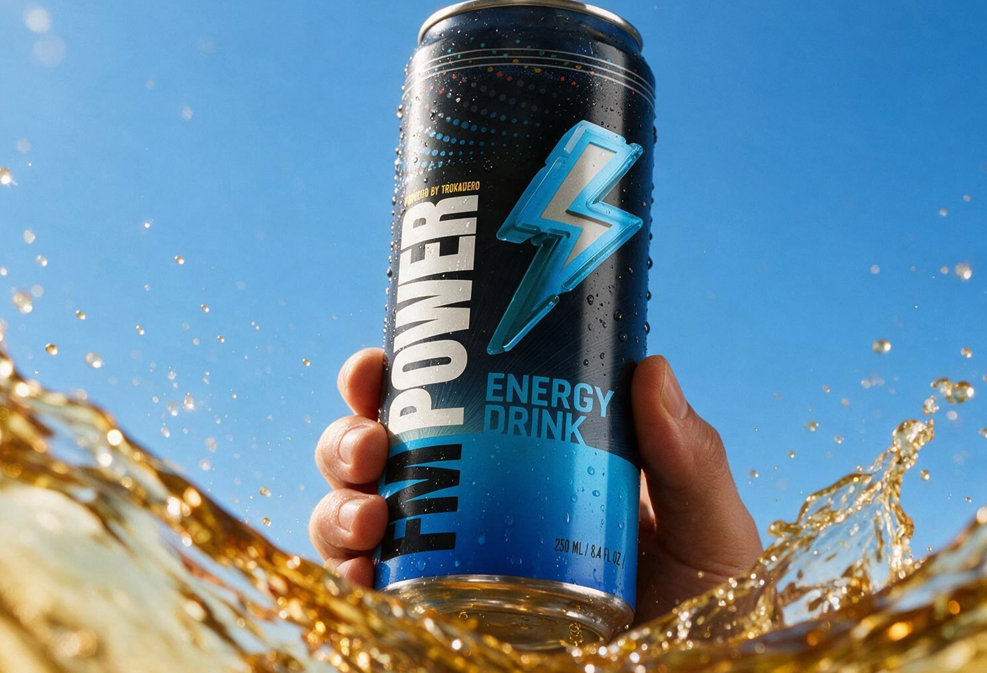
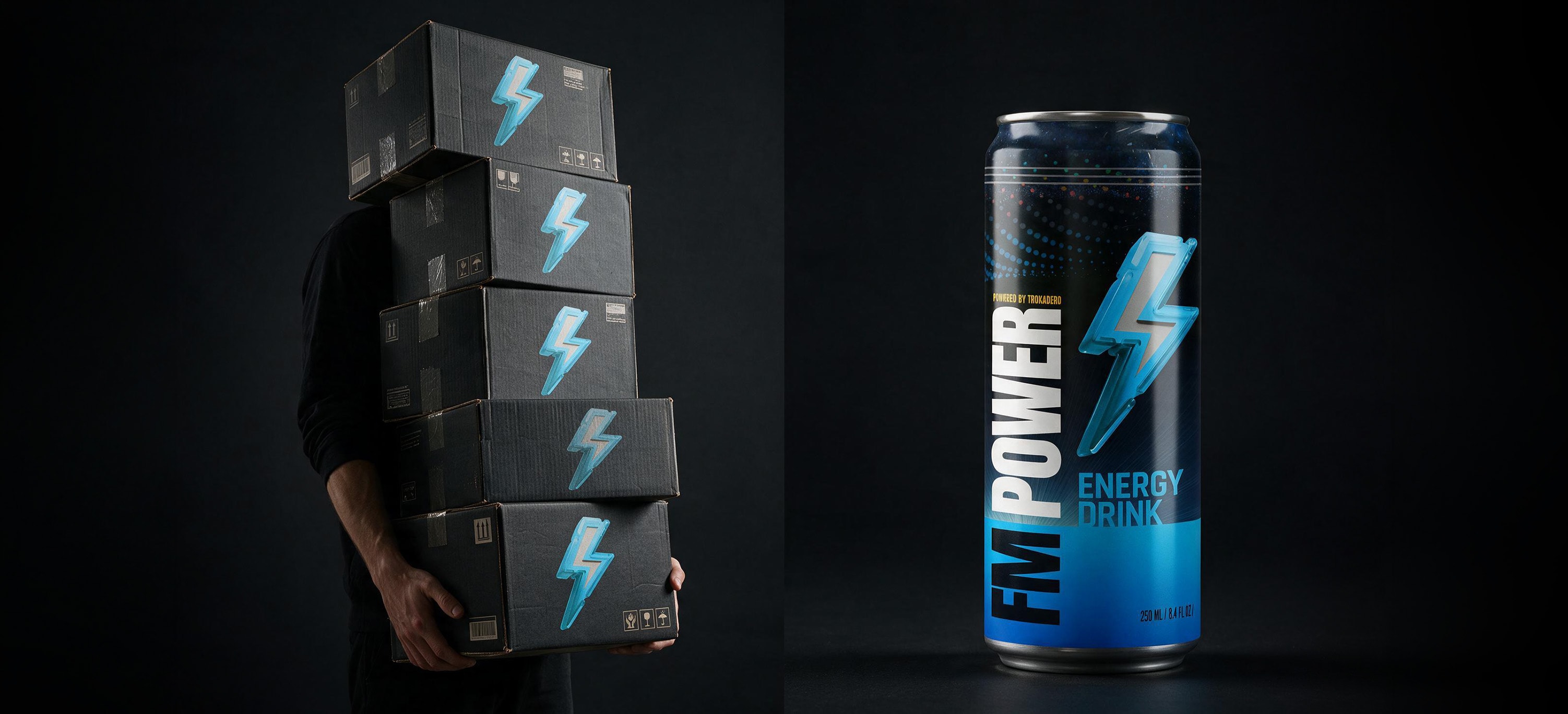
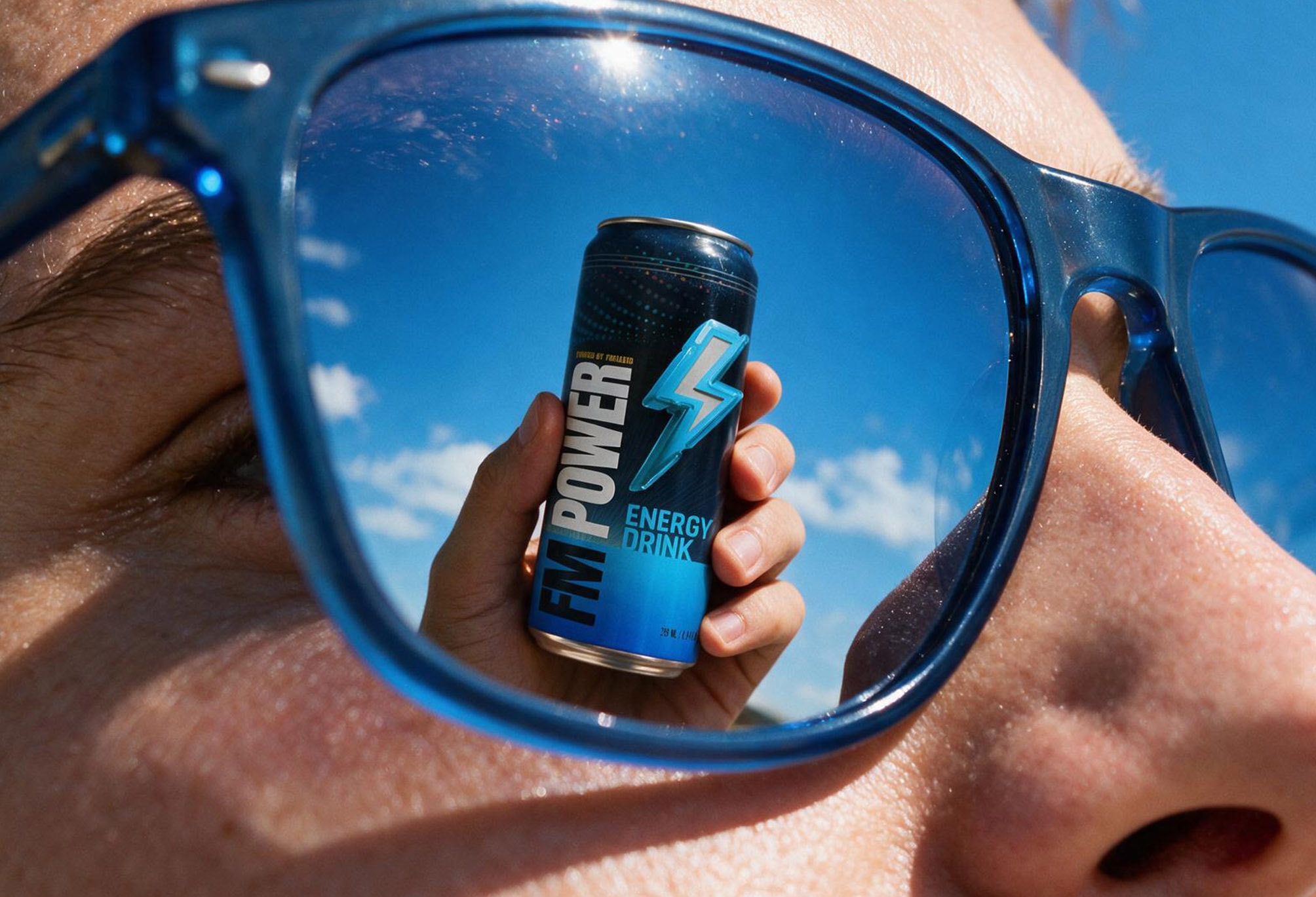
So this route was built in the opposite order. One proprietary object, drawn first. A flat ground that exists only to hold it. The can became the smallest unit of the brand rather than the whole of it, and once the mark carried the design, the design stopped needing the can. It holds at 40mm on a chilled 250ml body, in one colour on a corrugated carton, in three threads on black twill, and as a reflection small enough to sit inside a lens. None of those applications required a new design. Only a new size.
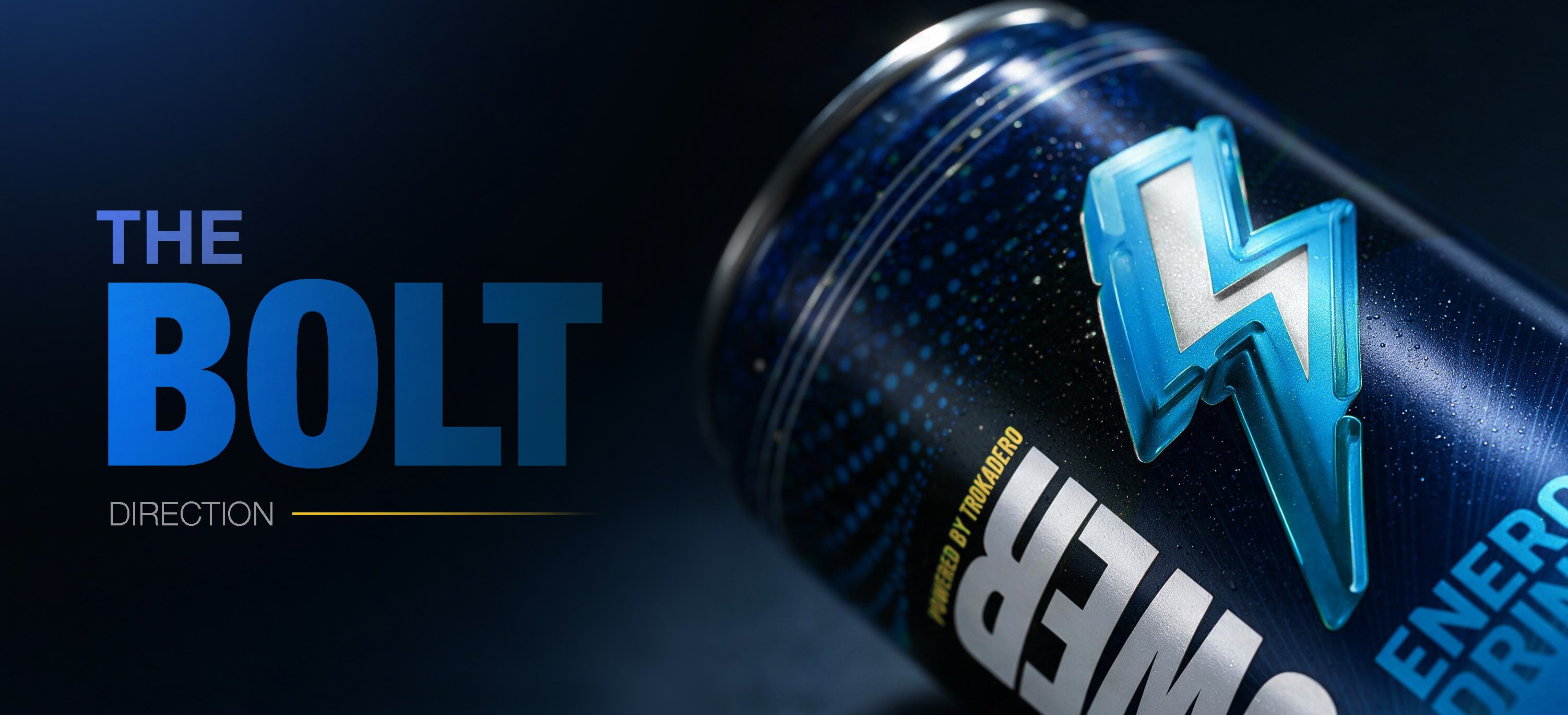
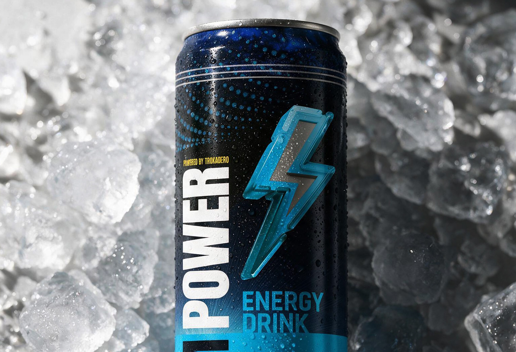
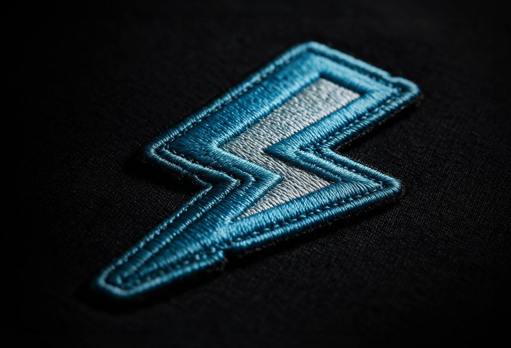
Blue is the ground, not the subject.
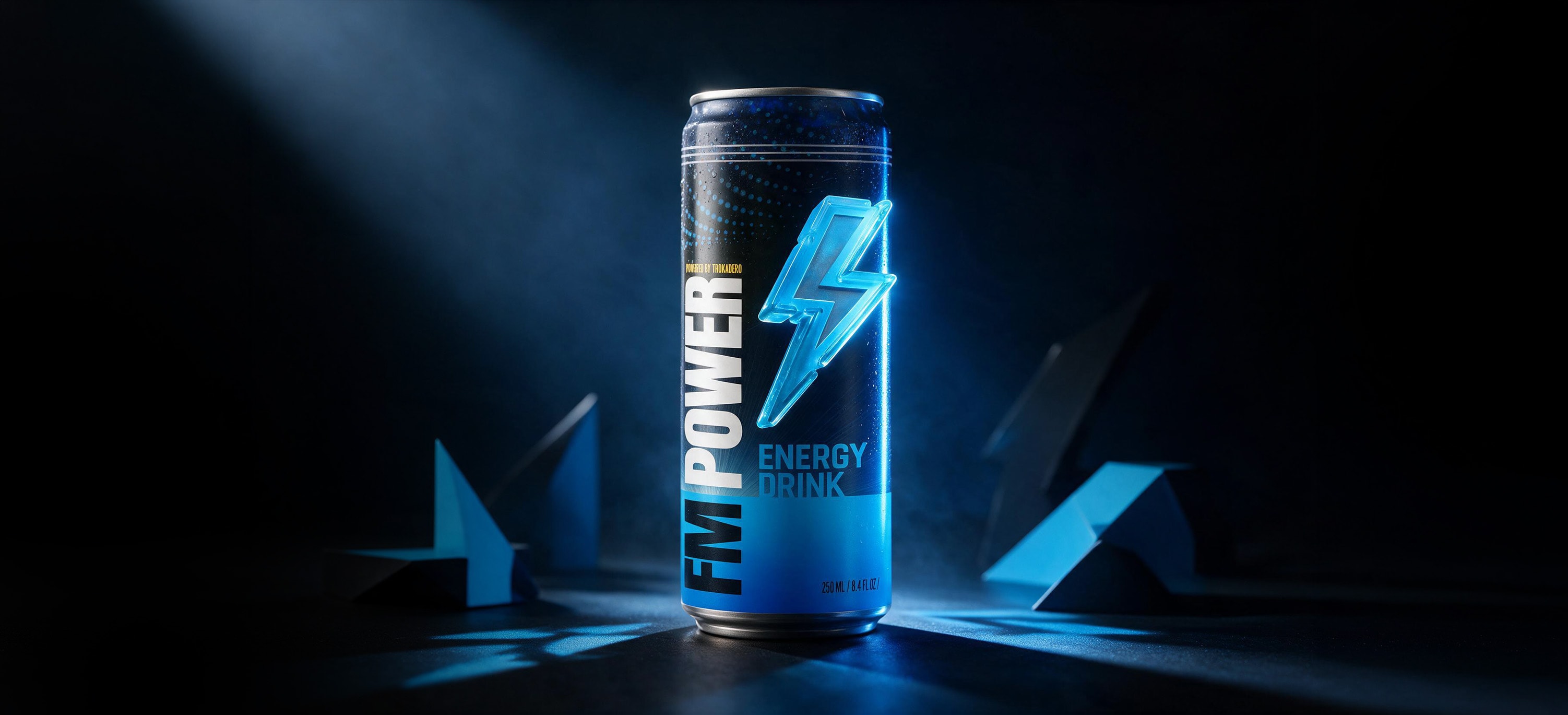
The palette runs deep navy to cyan and stops there. No secondary accent, no warm contrast, no third colour introduced for variety. The restriction is the mechanism: with nothing else competing, the bolt is the only thing the eye can land on. Every application obeys the same rule, which is why they read as one brand rather than six executions.
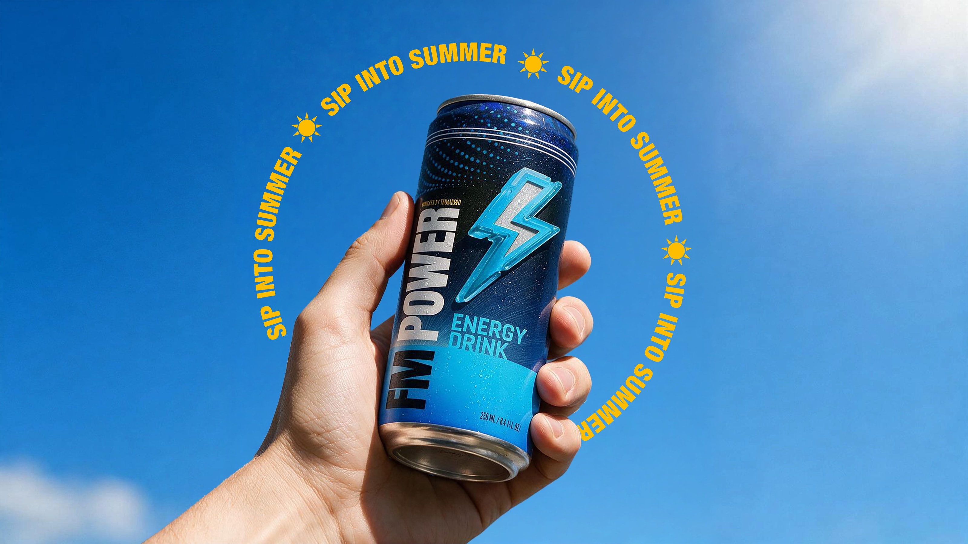
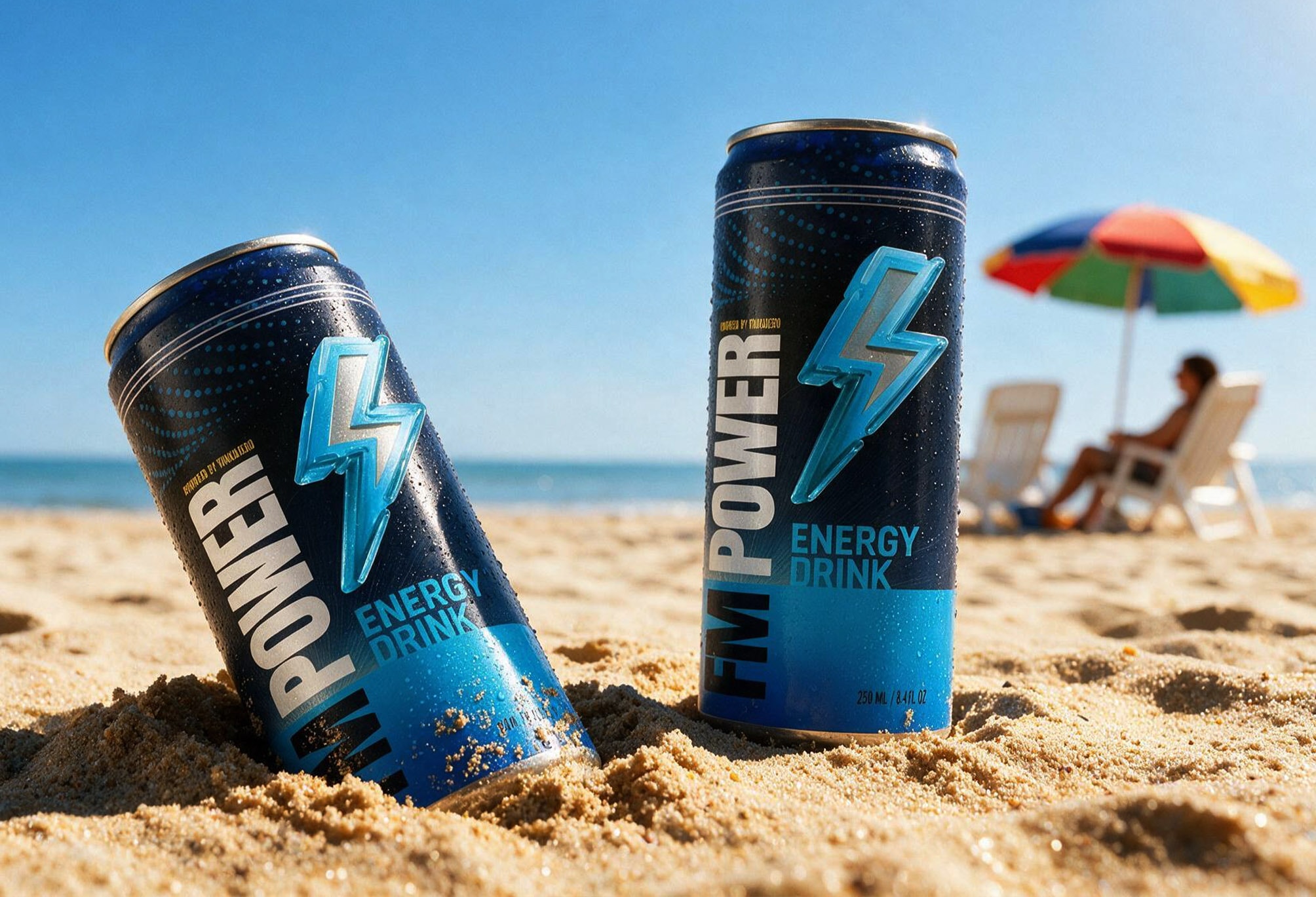
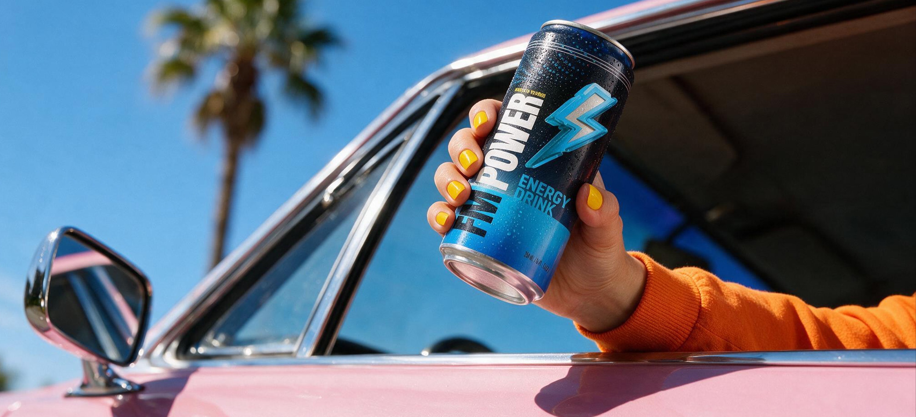
Sip into summer.
FM Power was positioned as the drink you reach for when the temperature rises. On the beach, by the pool, at a rooftop gathering. The kind of can that sits in a cooler next to ice and limes, that gets mixed into cocktails or cracked open between swims. The summer campaign leaned into that energy: sand, sunlight, sunglasses, and a bolt of blue against a wide open sky. Not a gym drink. Not a late night study aid. The friend you bring to the shore.
The route it was measured against.
Challenger
Built for the people who earn the drink.
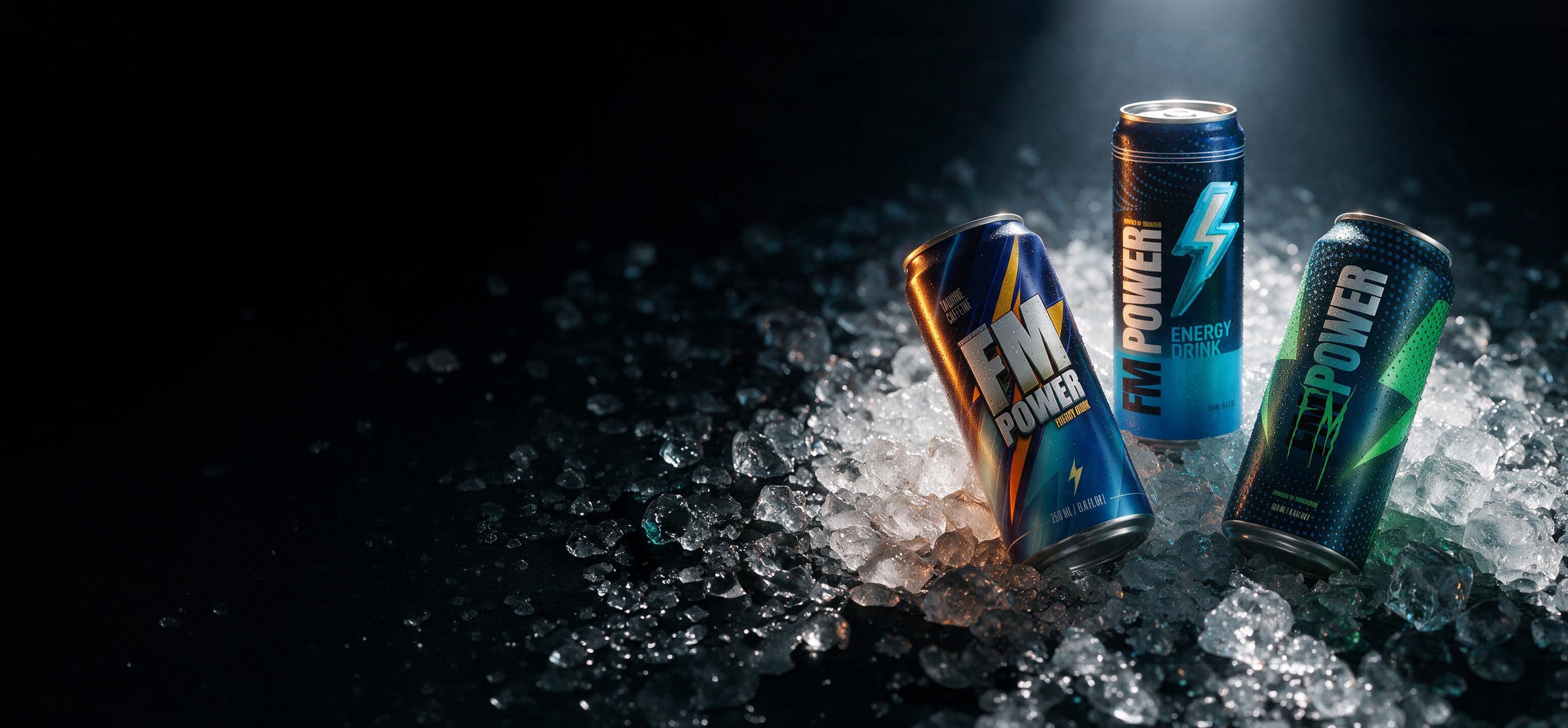
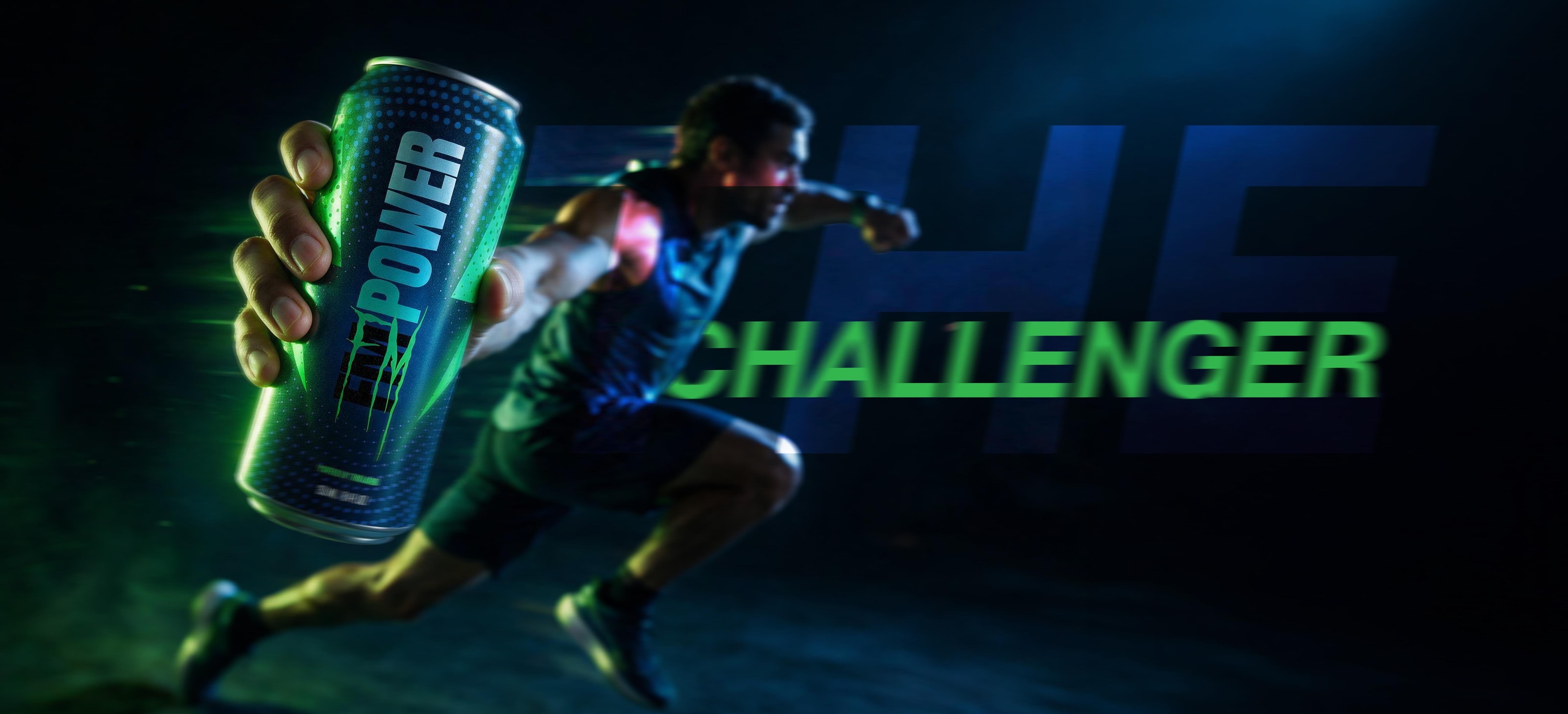
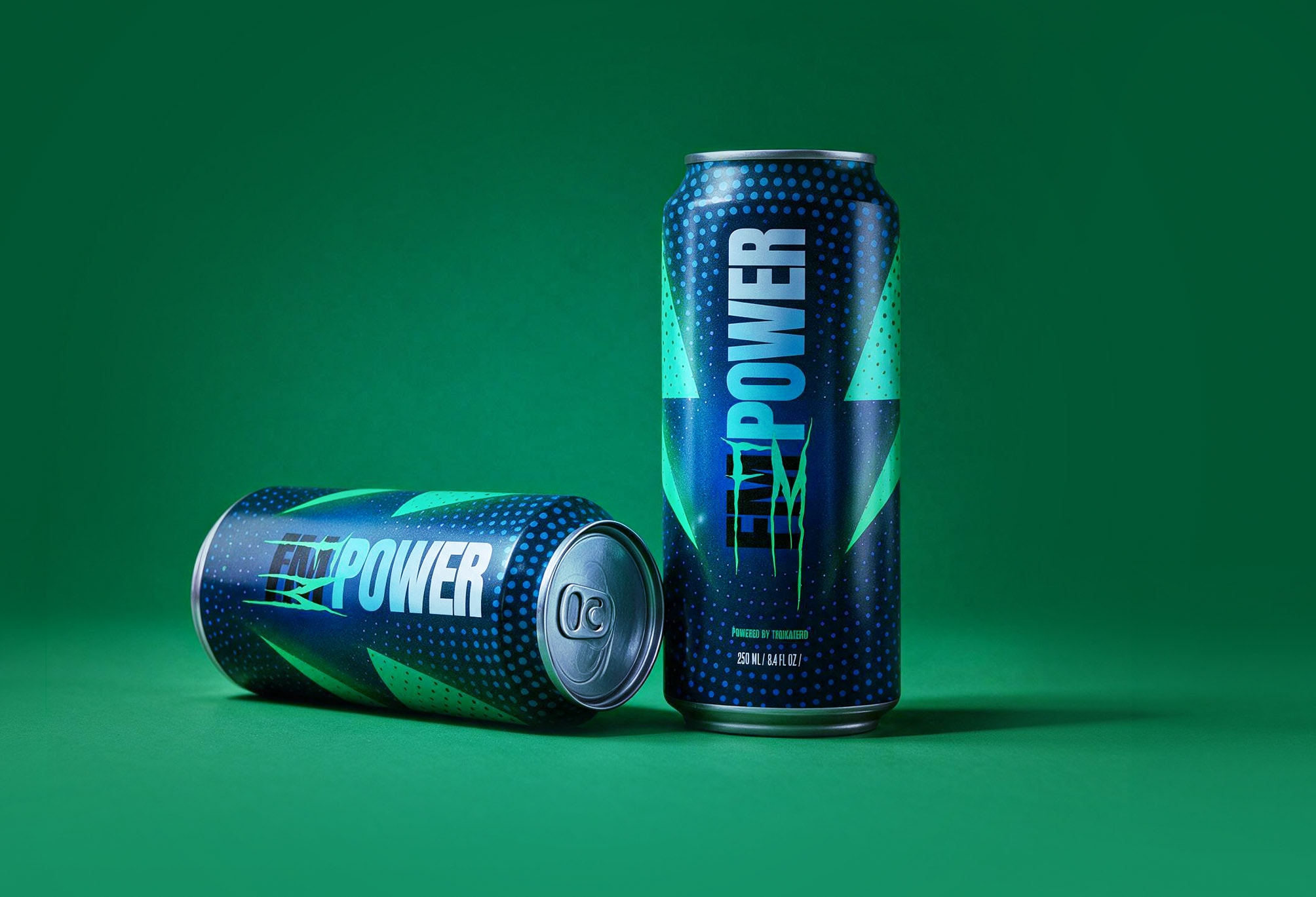
High-chroma green on black · halftone field · clawed lockup
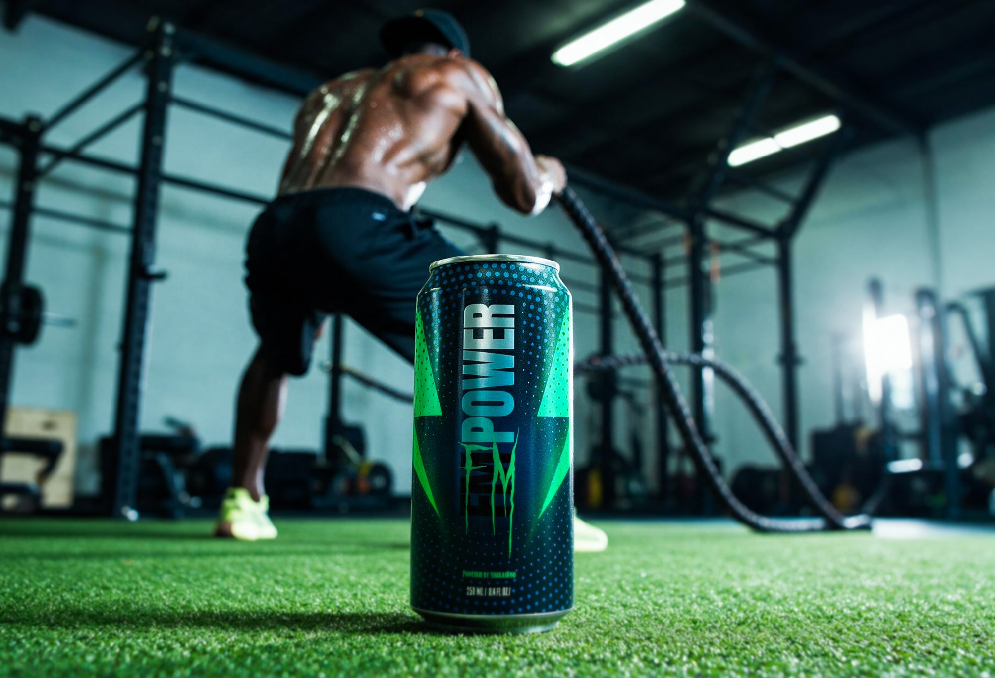
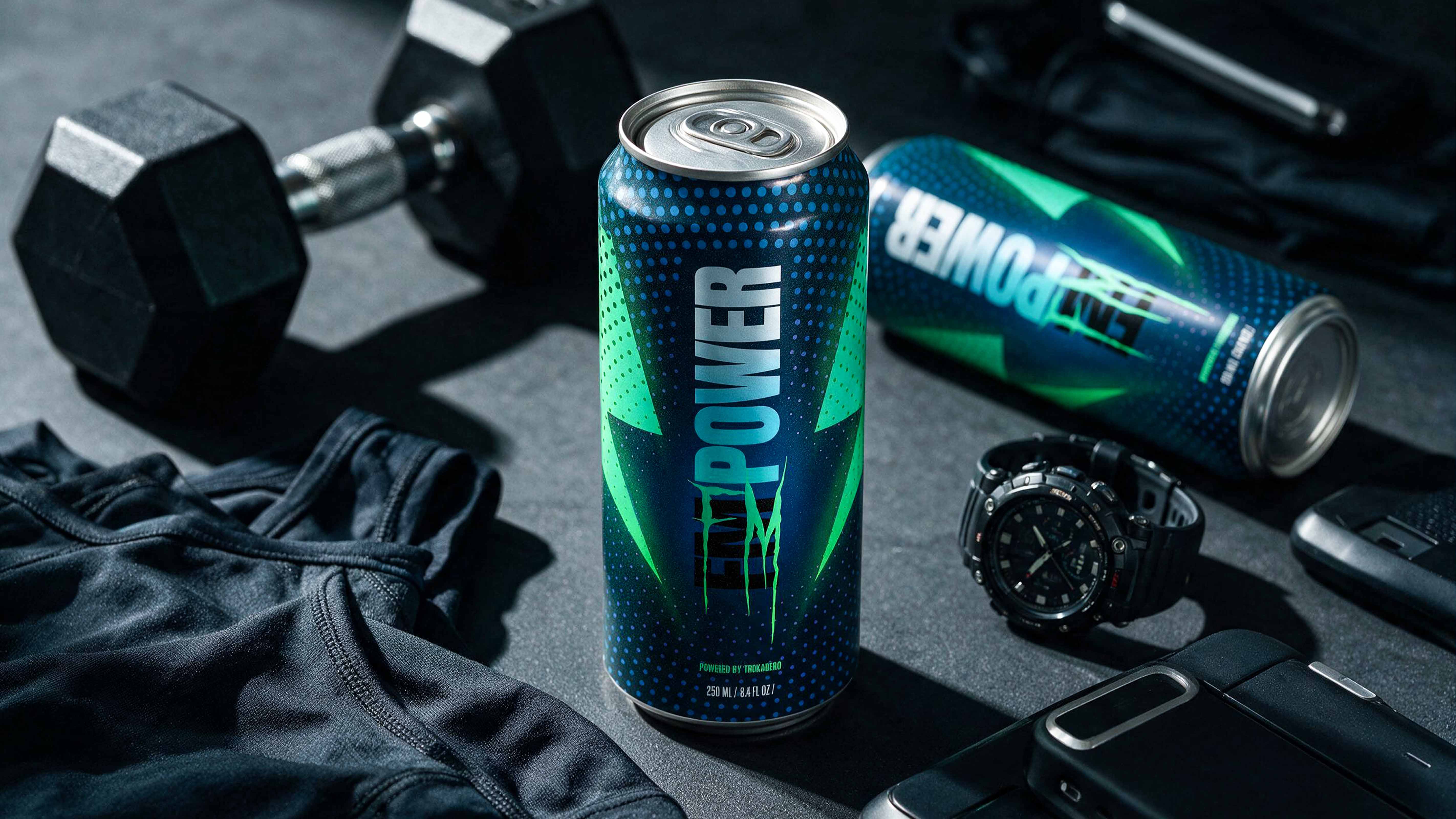
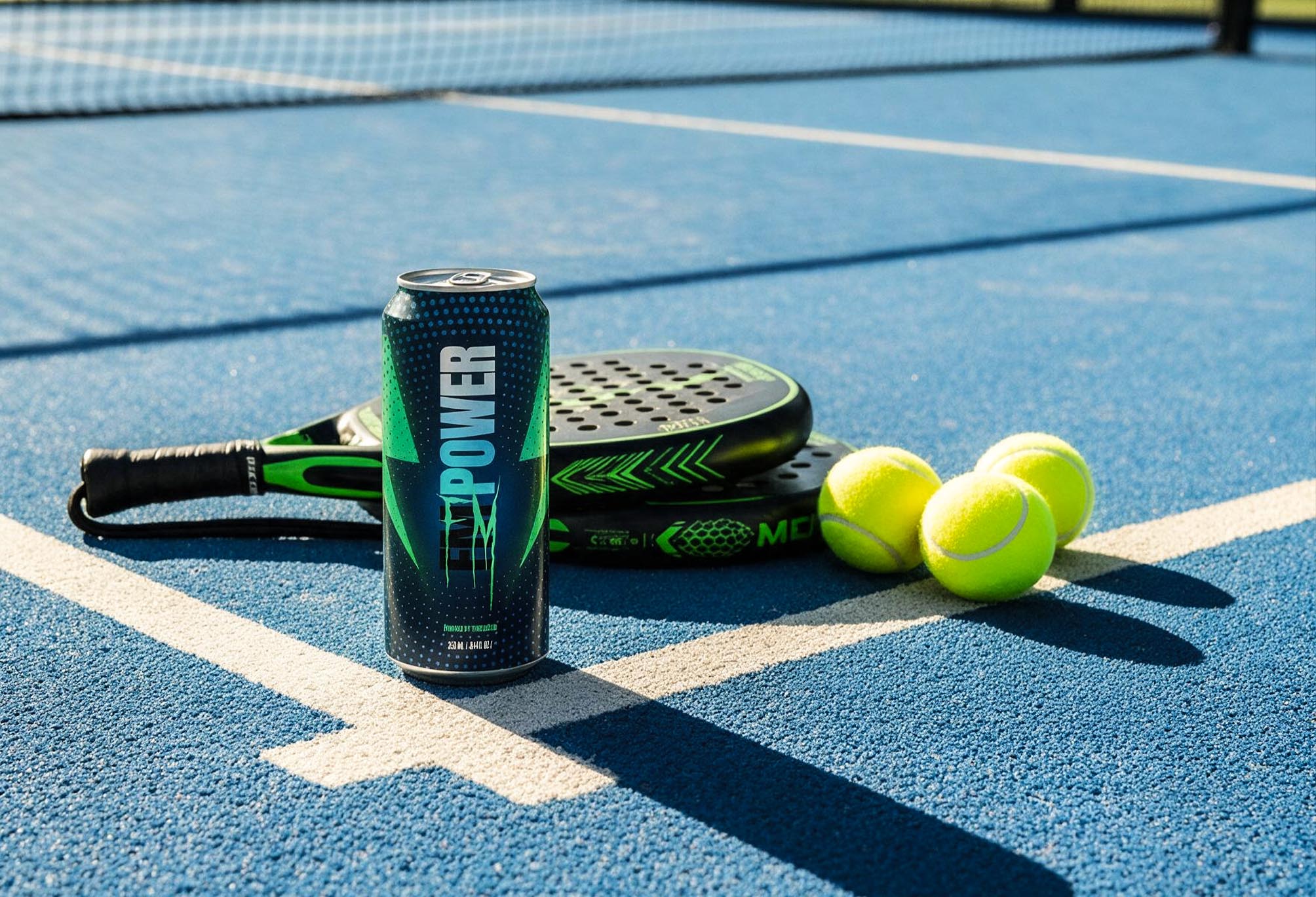
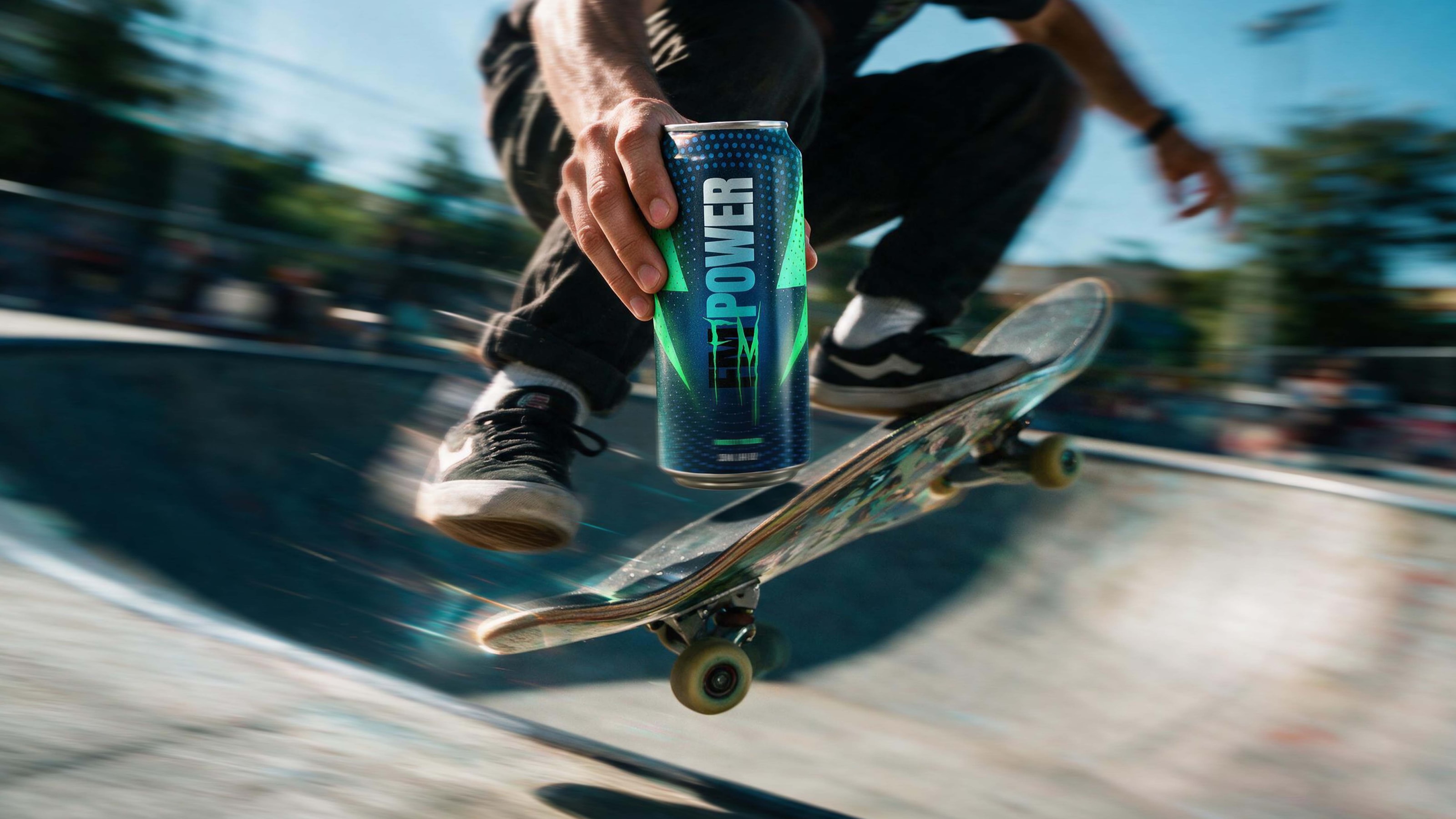
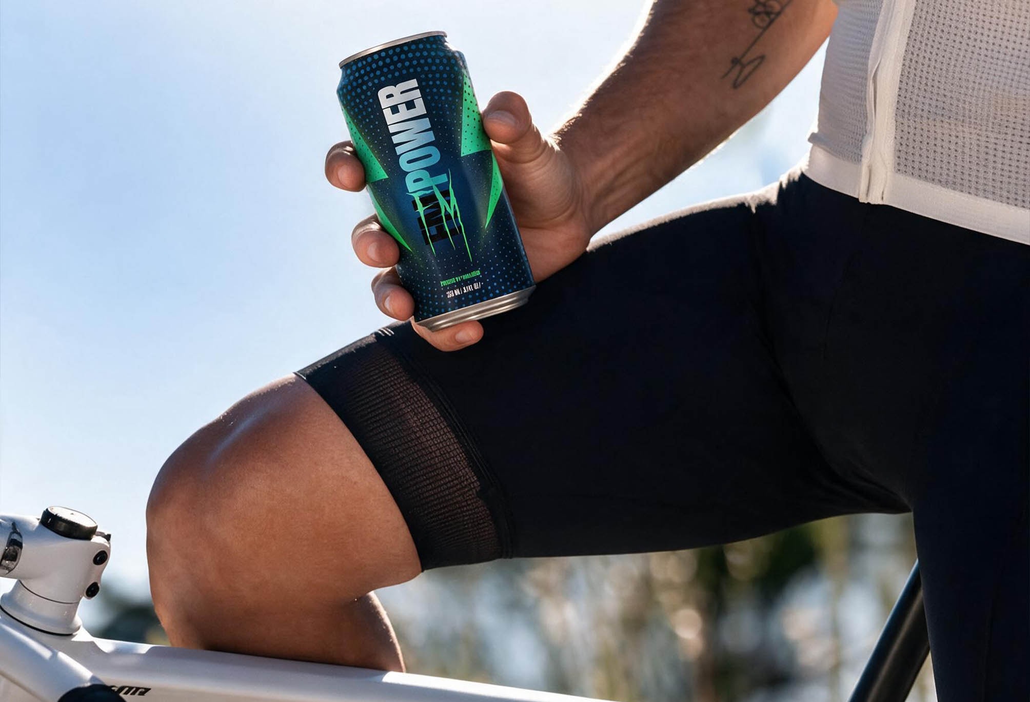
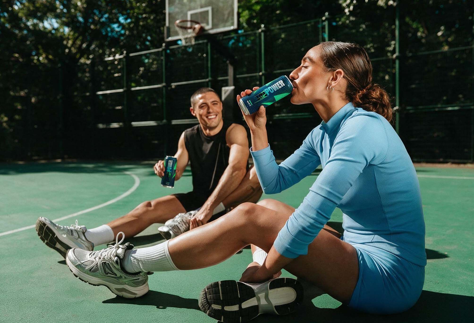
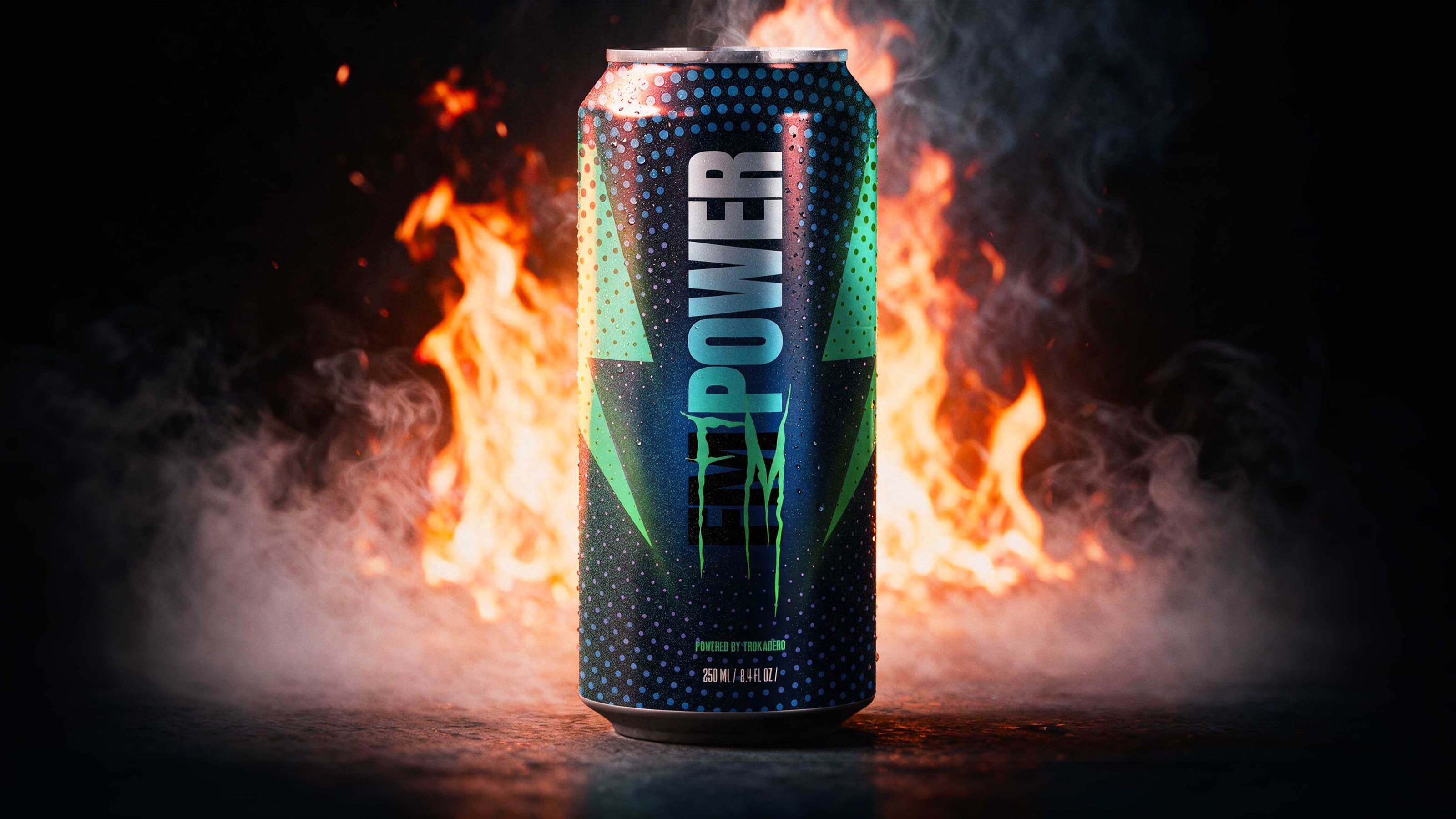
The Bolt was designed for the shelf. This route was designed for the person already sweating — the daily gym member, the boxer, the athlete who buys energy as fuel rather than as a treat. That audience doesn't discover a can in a supermarket aisle. They meet it in a gym fridge, a locker room, a training bag, at the end of a session, in bad light. Everything here follows from where the can is actually held. High-chroma green on black is the highest-contrast pairing available under fluorescent gym lighting and after dark — it holds when the surface is wet, when a hand covers two-thirds of the label, and when the can sits on a rubber floor beside black equipment. Green reads as charged, chemical, go; black drops the surround to zero so nothing competes with it. The halftone field builds density toward the base, keeping the lockup clear at the point the hand covers least. The letterforms are drawn with deliberate aggression: split, torn, claw-cut, weight-heavy. That vocabulary is already fluent in this market — consumers read those forms as energy before they read the name. Borrowing a category's grammar is a decision with a cost, and it was made knowingly and at the client's direction: recognition arrives faster, ownership arrives later or not at all. The route was presented on exactly those terms.

Where it landed.
The Bolt was the recommended direction. It was the only route whose central element belonged to the brand rather than to the category, and the only one with anywhere to go after the can. [CLIENT DECISION]
Two answers, two costs.
Challenger buys recognition. It speaks a vocabulary the market already knows, so it is understood before it is read — and it can never be exclusively owned. The Bolt buys ownership. It asks for a moment of attention first, and returns a mark that works at every size, on every surface, for as long as the brand wants it.
Both were correct answers to the brief. Only one of them was still an asset a year later.
Design the asset. The pack follows.
- Rafat Mhalla
- FM Power (powered by Trokadero)
- 3D rendering and AI-assisted imaging
- 2022